Well Lean UI/UX and Branding
Well Lean redesign was done in 2020 and updated throughout 2021
I was the creative director for Well Lean LLC, responsible for product/packaging redesign, brand design, website/mobile site redesign, marketing material design and overseen 3 marketing / UX research interns.
1. Project Overview
About the project
Well Lean is an E-commerce brand specializes in providing Konjac/Shirataki food products to those who want to live happier and healthier lifestyles. My responsibility including UI UX refresh, product design and marketing material design. This page will mainly talk about website redesign.
Tasks
· Updating the UI to modern UI standards
· Improving and increasing conversion rate through UX research
· Standardize the brand with a style guide across products, website and marketing materials.
· Providing a unique and catered experience for Well Lean customers.
2. Research - Creating A New And Engaging Experience
I made use of Google Analytics, Shopify Analytics, in-person customer interview and competitor research to gain a better understanding of who the audience was. It helped us to paint a better picture for our customer persona. I used information such as age, gender, location and devices being used in relation to number of purchases and conversion rates as our basis for the redesign.
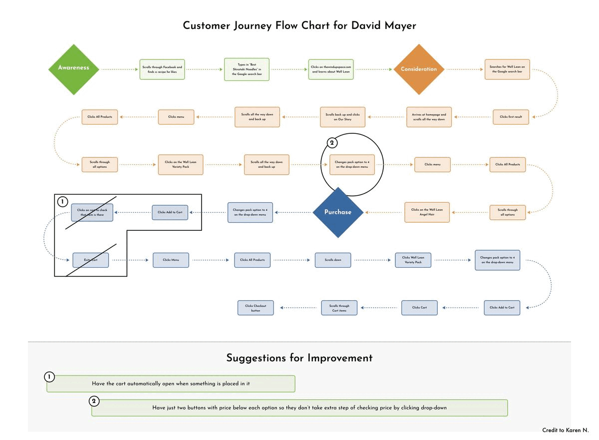
3. Flow Charts and Usability Study
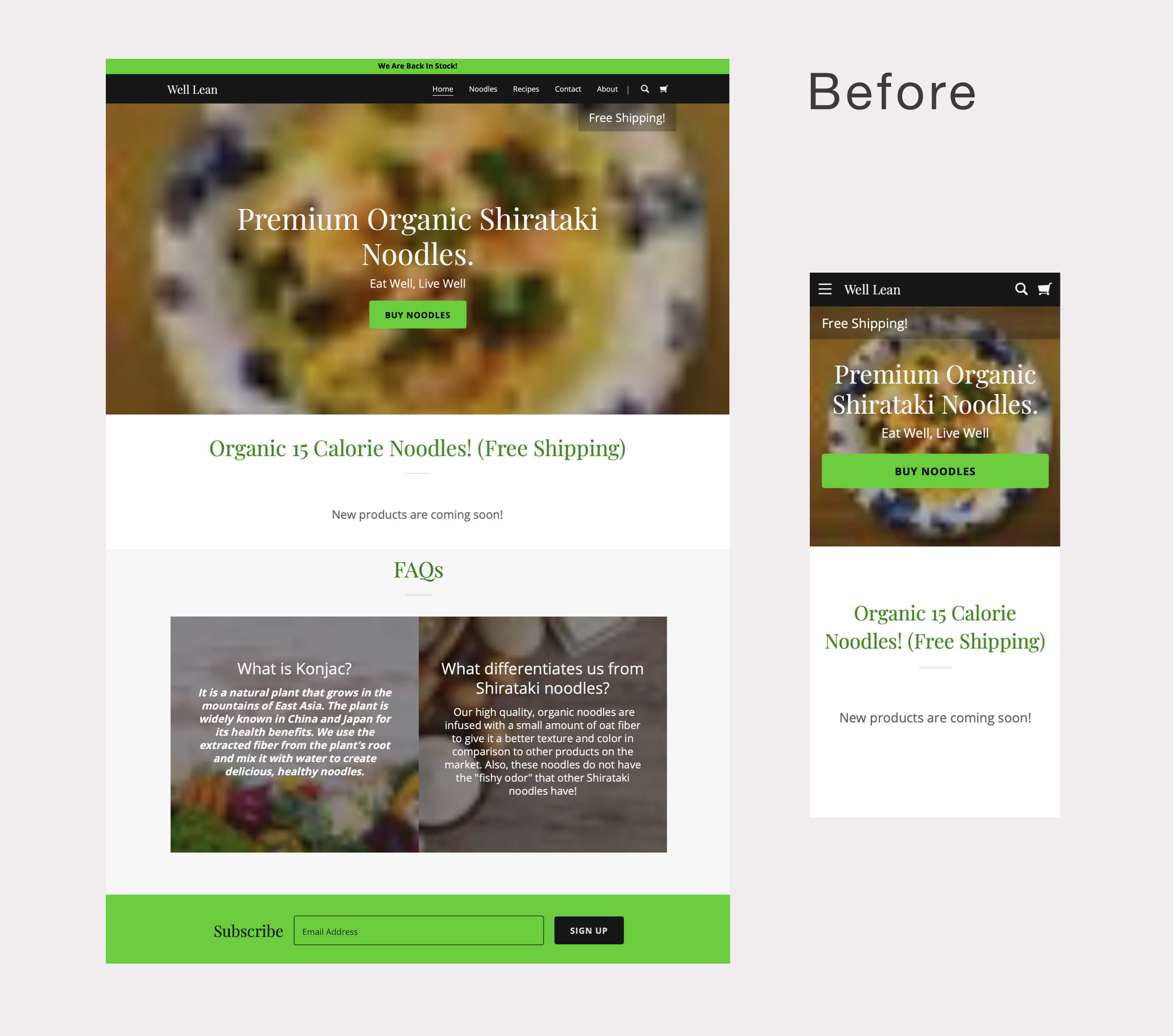
Website - Mobile First Design
Several data points were used to learn that most of our customers uses mobile phone to browse and purchase. Our target demographic is mainly in the age range of 34-45 years old and 50+. This made us carry out several usability tests to ensure our mobile interface works well for those in that age brackets.
Usability Study
Several usability test were carried out throughout 2020-2021, including one with our intern Karen N. Through in-person and remote interviews, we learned that by increase our product discoverability, shorten the product selection page and shorten the check out process, we can effectively increase our conversion rate.
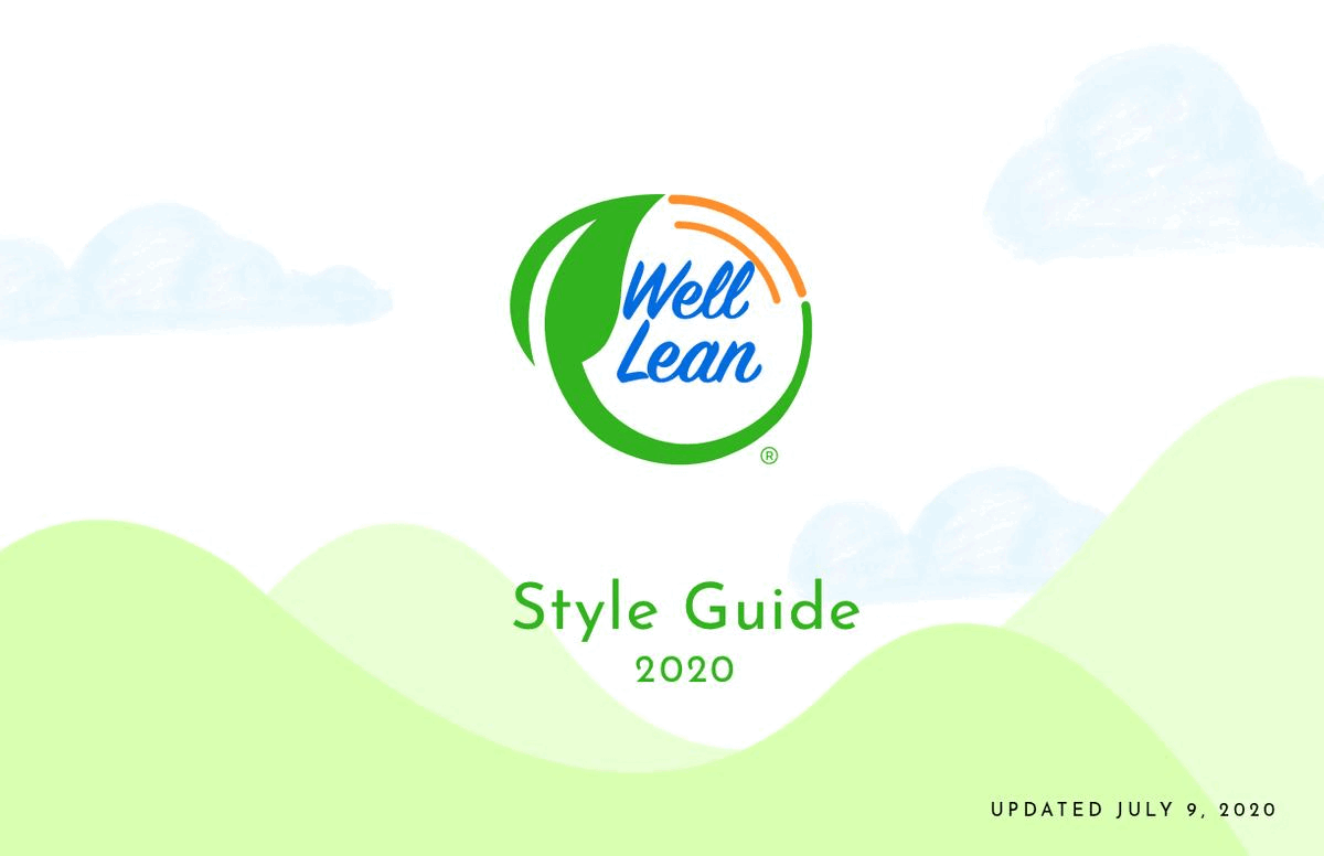
4. Style Guide
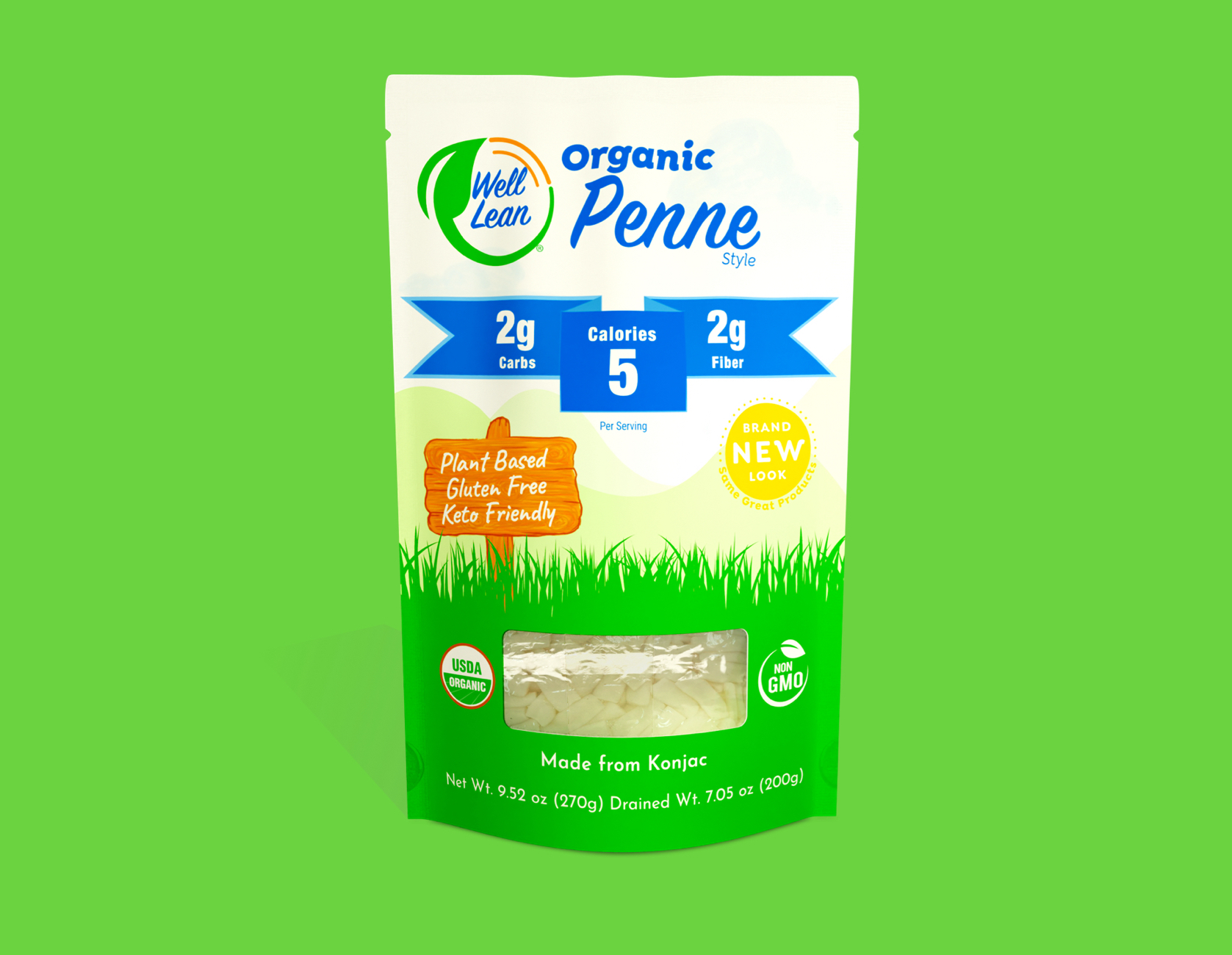
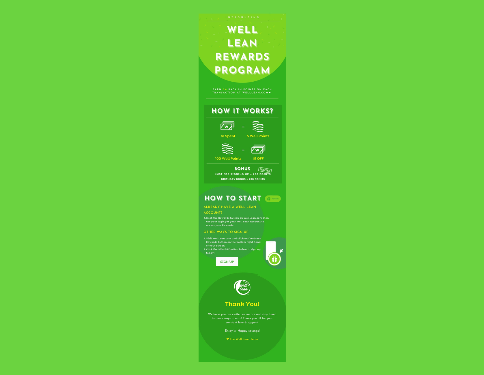
Created a style guide based on our target demographic, brand identity and mission. This was later used in packaging rebranding, marketing materials and email marketing campaign. This standardized Well Lean as a prestigious and consistant brand.
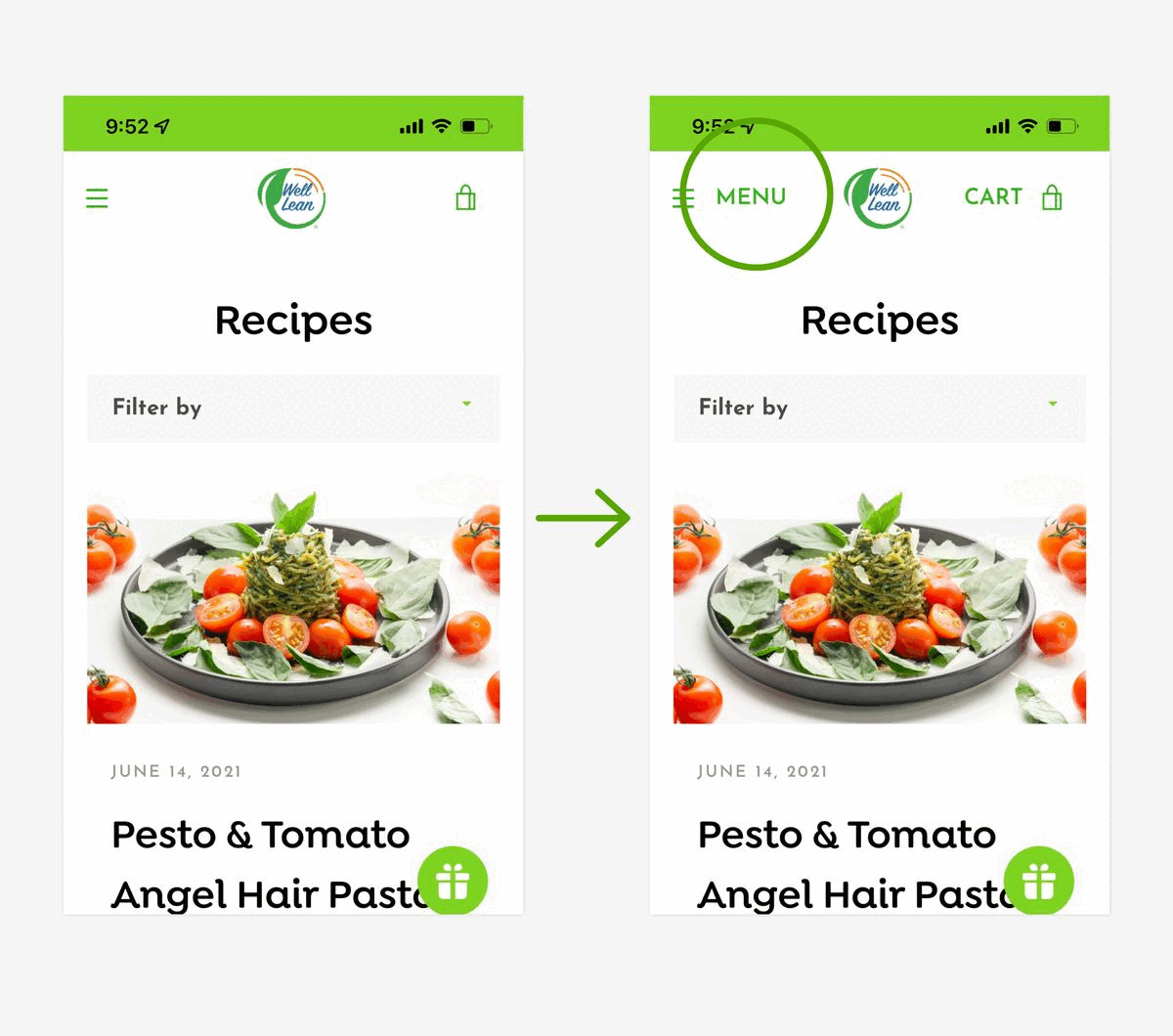
5. More Usability Testings
Several more usability testings were carried out. Here are part of some small changes that were made:
Adding "MENU" and "CART" next to the icons
WHY? According to some of our older customers, hamburger icon and bag icon does not immediately screams clickable menu and clickable cart.
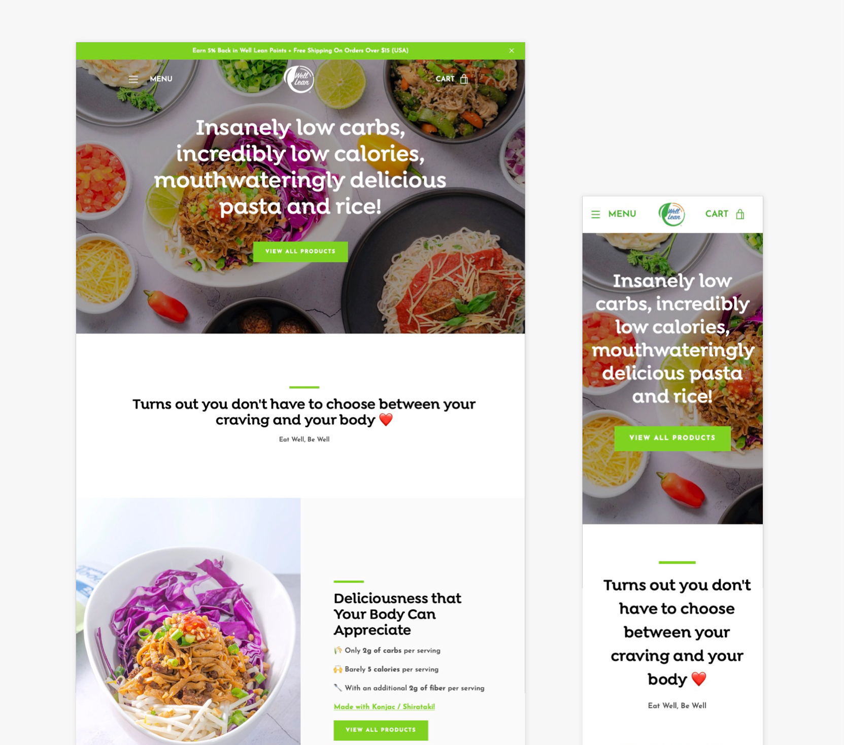
Changing the name of the button to "View All products"
WHY? We noticed a lot of our customers (new and old) went out of their way to click on menu > view all products when "treat yourself today" takes them to the same page.
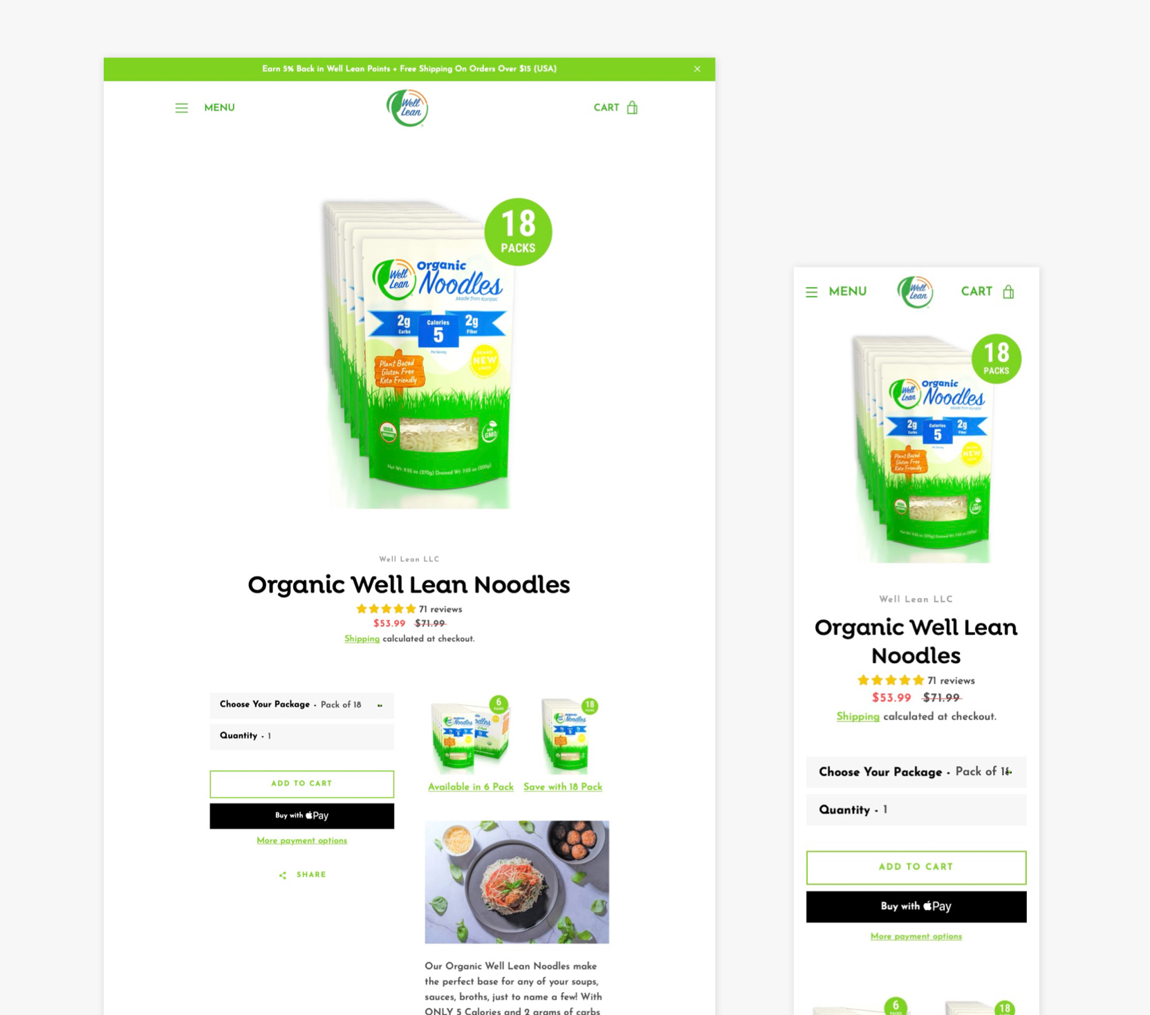
Adding a visual variant selector to product page
WHY? A lot of users are not familiar with the dropdown variant selector during our usability testings, so we implemented a visual one.
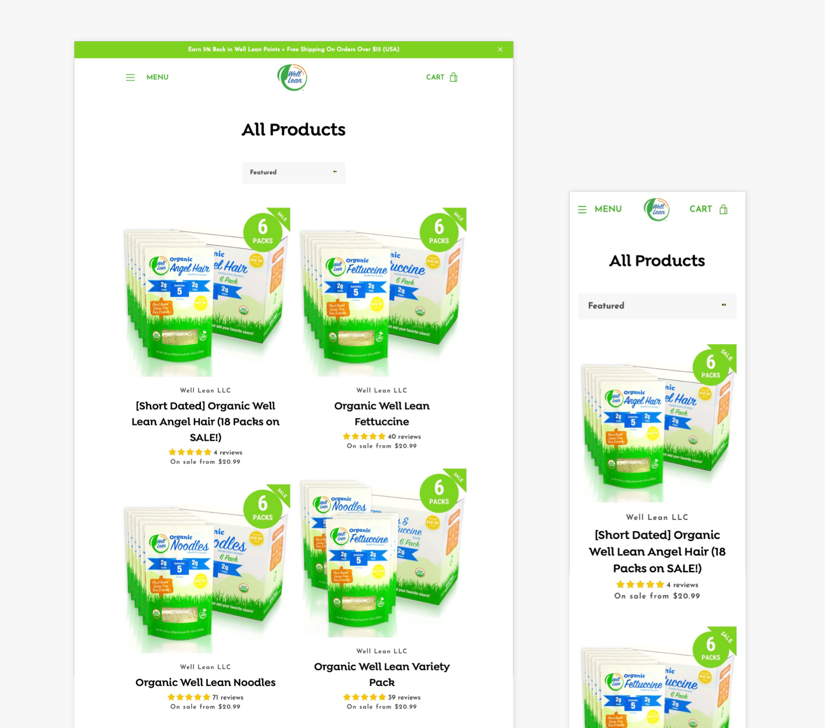
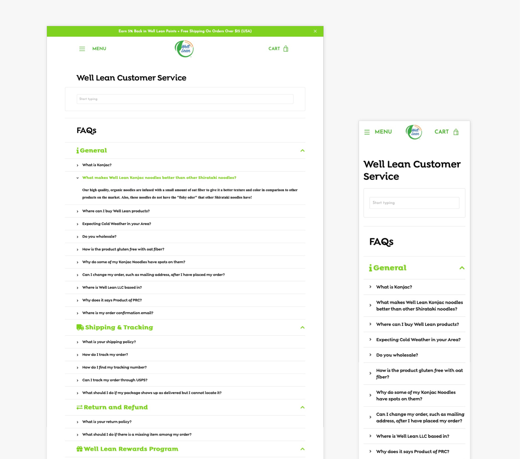
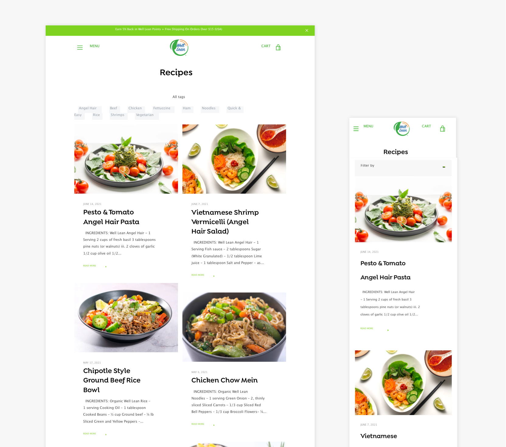
6. Final Result
Here are the screenshots of the final result for welllean.com redesign
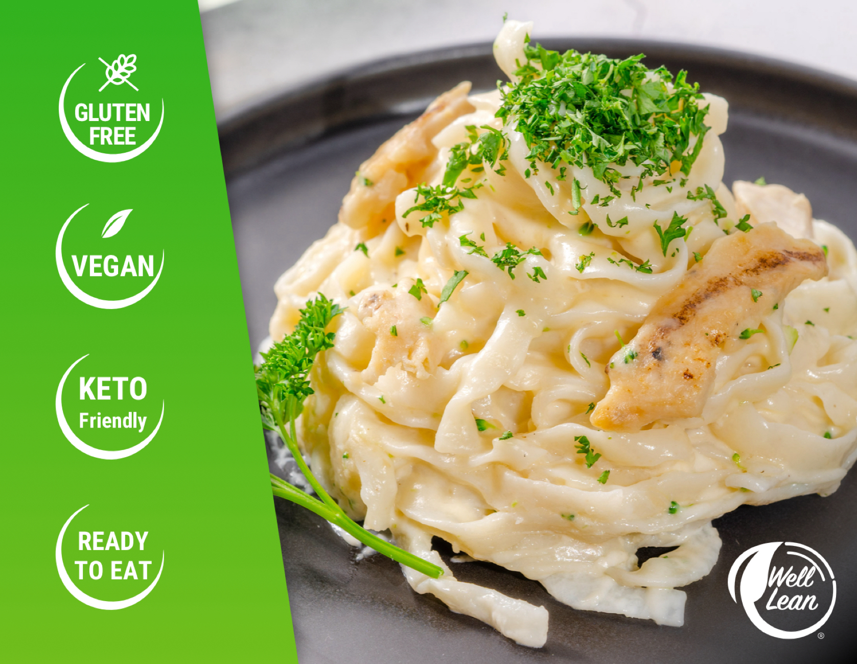
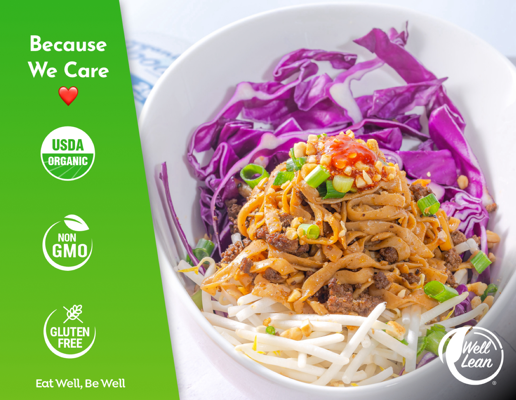
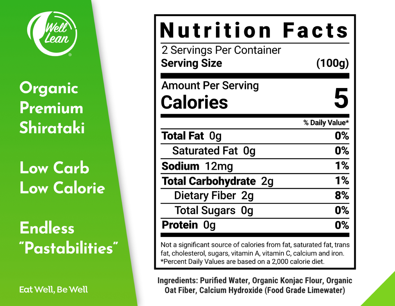
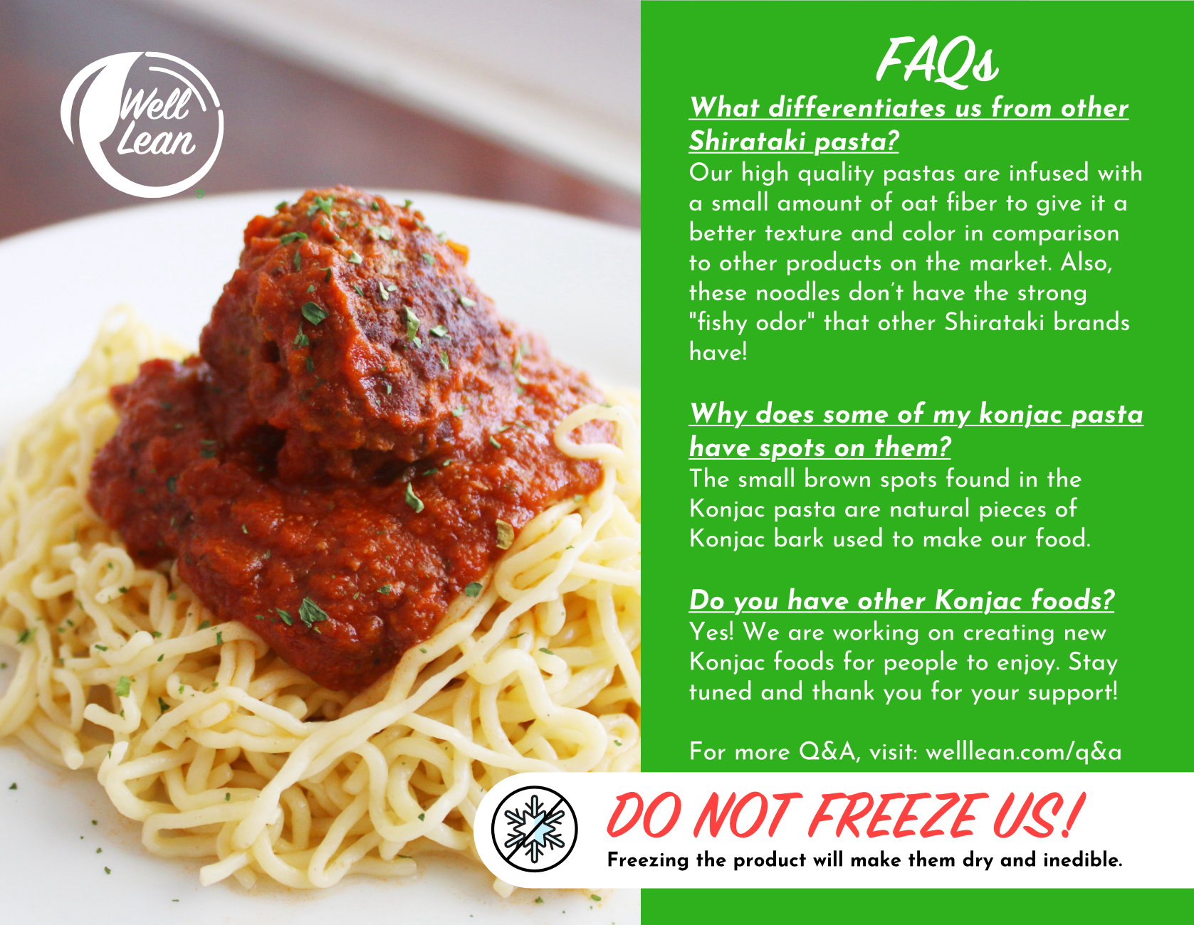
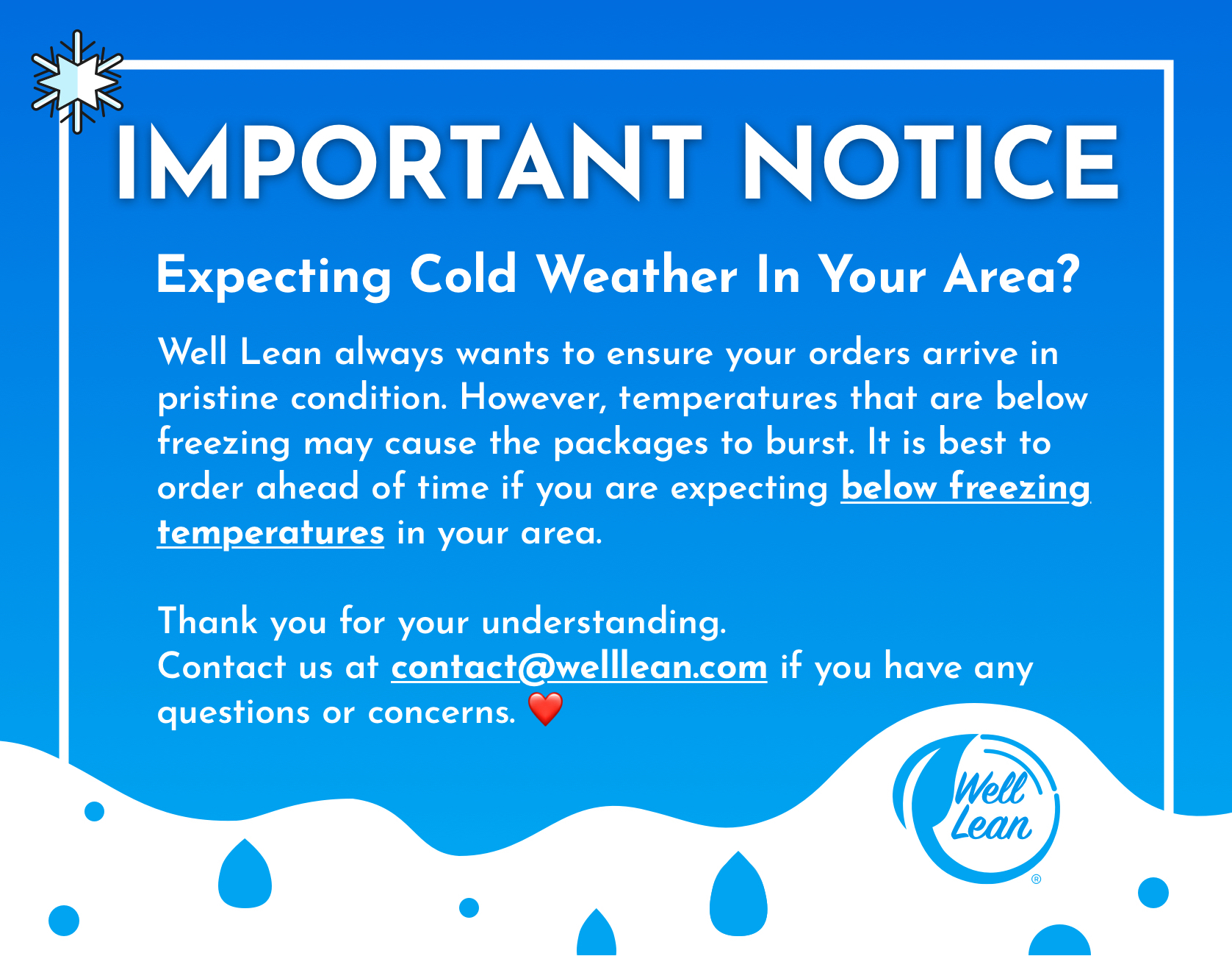
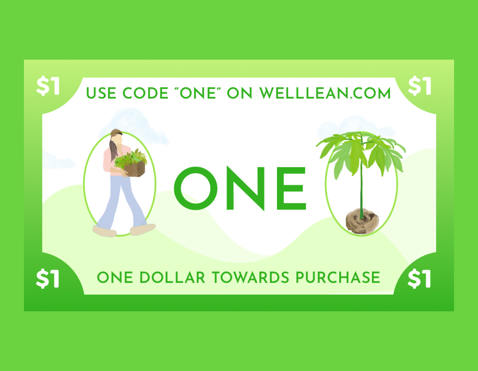
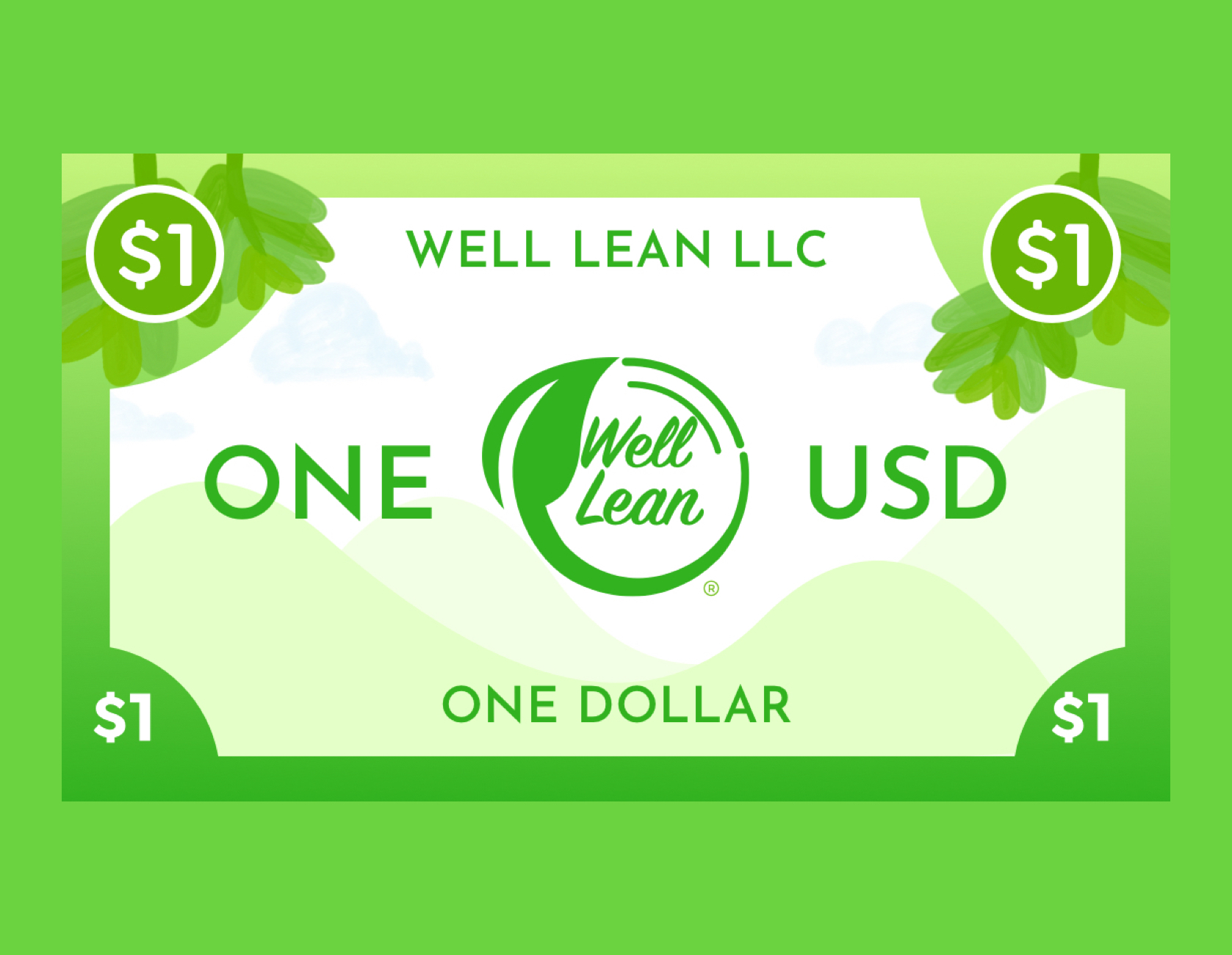
Extra: Marketing and Branding Material Designs
Here are some marketing / branding / packaging design samples I made for Well Lean LLC