GoShare UI/UX
Here's the GoShare iOS app UI/UX redesign I did in 2018.

1. Project Overview
About the app
GoShare is an app that connect people with truck and van owners for moving, hauling or delivery help. Their current app is shown on this photo.
Tasks
· Updating the UI to modern UI standards.
· Improving the truck renting workflow.
· Research user persona and develop a new workflow .;
· Create a more user friendly experience.
· Design High Fidelity mock up.
2. Research
After I reviewed the requirements of the project, the first thing I did was to research the competitors of GoShare app. Experience their app as a user. Understand the differences, the flow of actions so I could learn from what was previously existed. I also reviewed app store reviews and conducted in person interview to observe how some of the users would perform a given task on GoShare app. This allow me to identify some of the user experience problems.
Competitors
Took notes of the user experience and user interface design of GoShare's competitors (Lugg app, Dolly app, trukPlease app).
User Research
1. Customer interview to define frustration of the current user experience
2. Reading up app store review to learn the positive and negative feedback written by previous users.
UI UX Trend
I like to check out the current UI UX trend on Behance.com, Pinterest.com, and color palette sites such as color.adobe.com to help me identify complementary colors for the style guide.
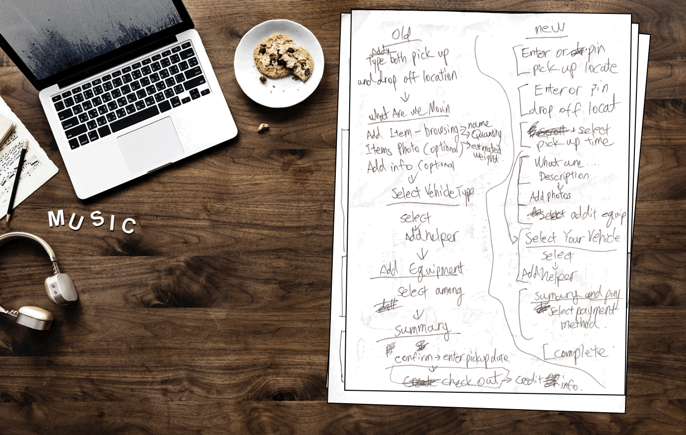
3. User Workflow Map
Problems
The research show some of the following complains:
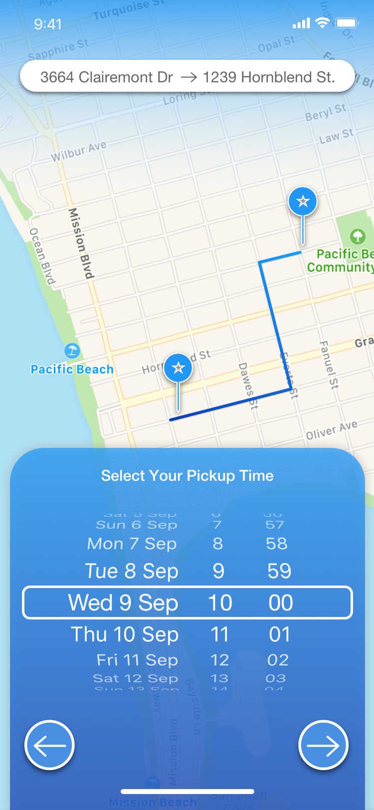
1. Inability to use the pin dropping function as an input for location.
2. UI look old.
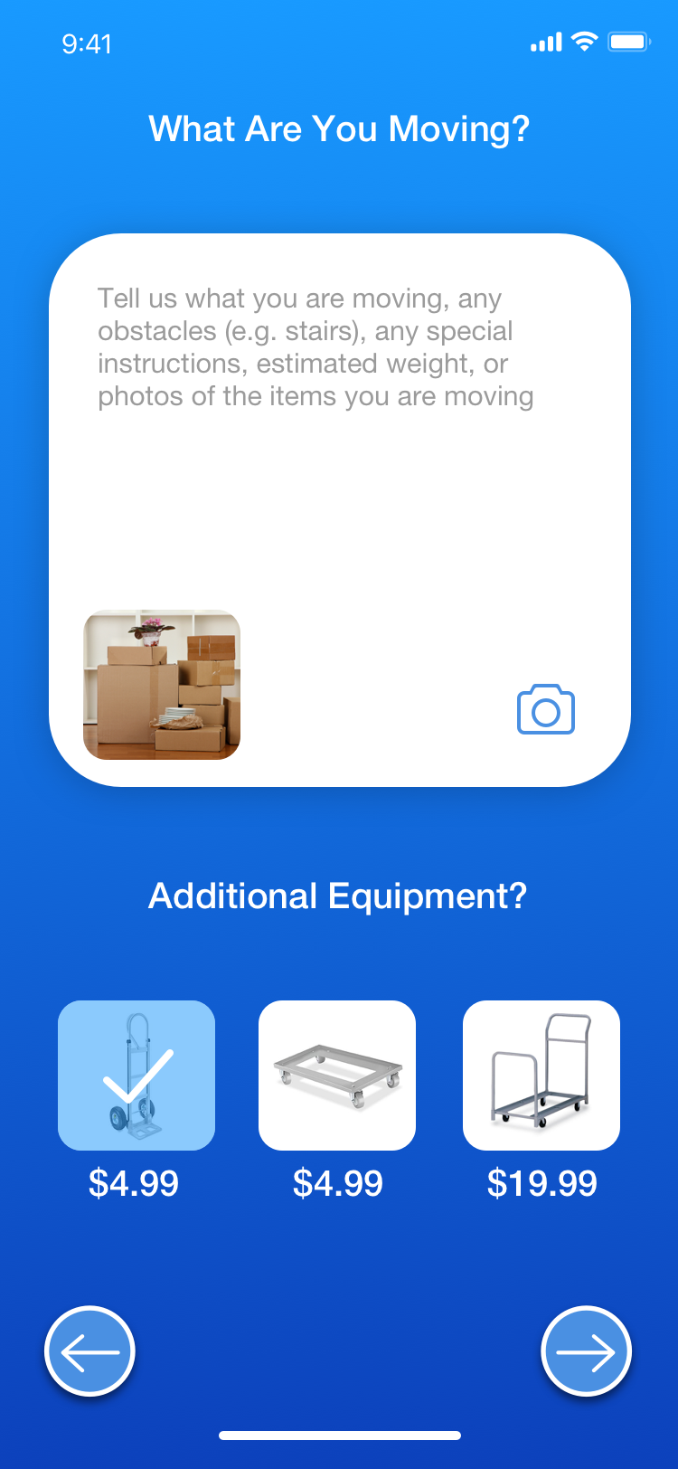
3. No idea what are the differences of those "additional equipments" when asked if user want any add-on.
4. Confusing and redundant interface when asked "what are we moving?"
Workflow Map
I sketched a new user workflow map addressing the complains found during the research process to improve the truck renting experiences.
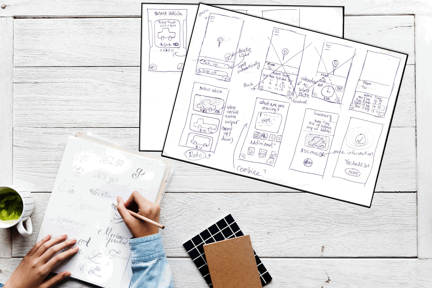
4. Wireframe & Prototype
After reviewing all the requirements and the newly developed workflow map. I picked up a pen and started drawing out the workflow as an app mockup, which was pivoted and revised over and over again until it is ready for high fidelity design.
5. Style Guide
A style guide was created based on the existing branding colors. I used the style guide to define the color palette and icon designs which were later used to create high fidelity design.
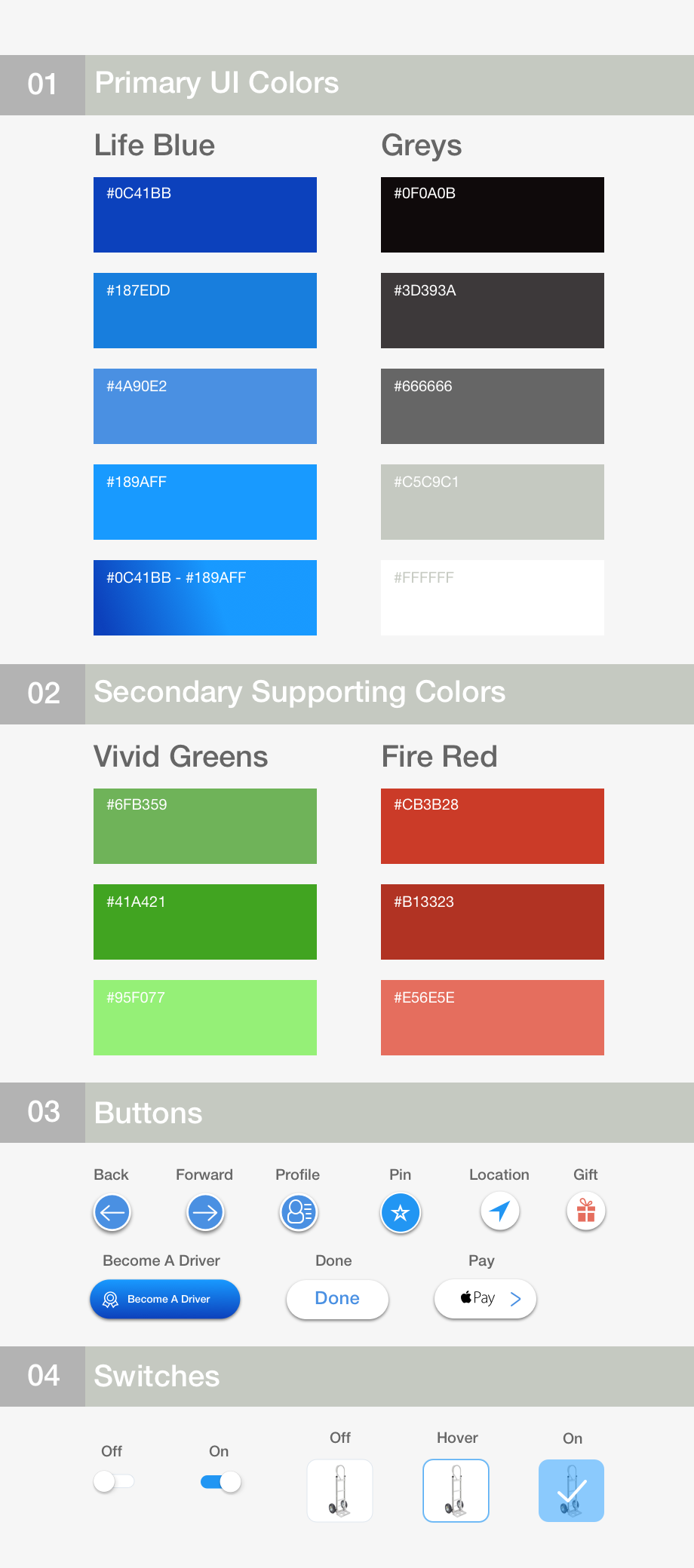
The color palette has been separated into two sections. The primary UI colors section consist of the colors that are used for the majority of the time and the secondary supporting colors section consists of colors used by small icons and buttons. Special thanks to Kevin Rhodes for mentoring me on style guide.
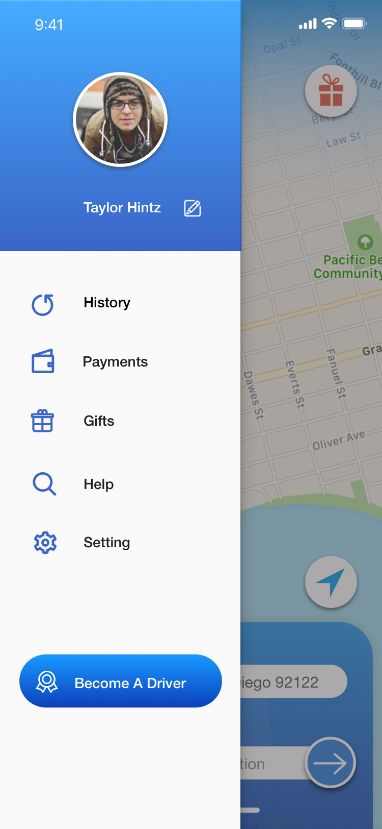
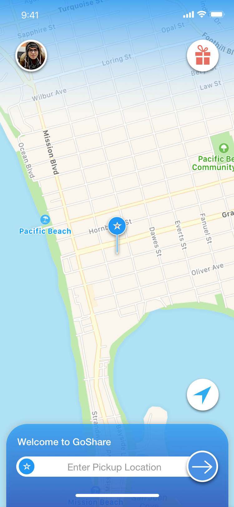
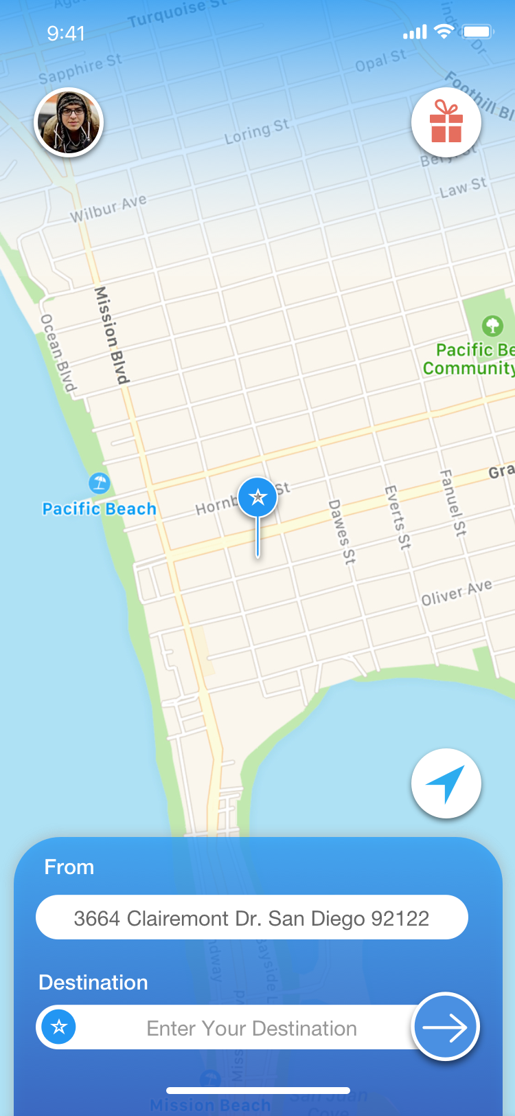
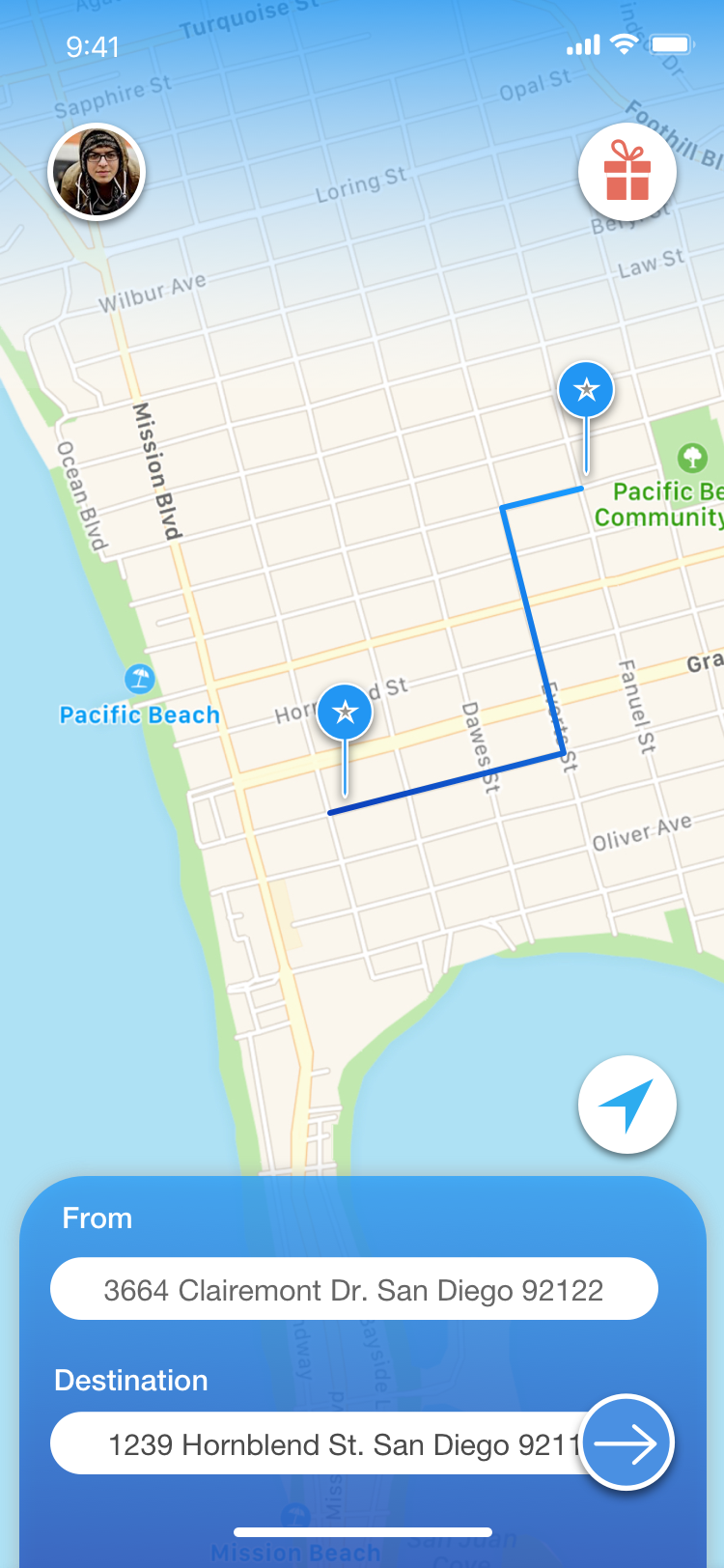
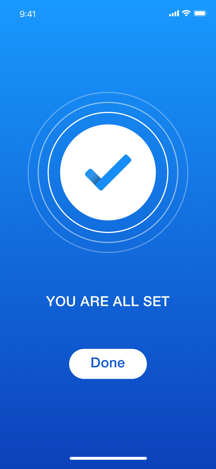
6. Final Result
Final result addresses multiple complains that was found during research stage:
1. The location arrow allows user to pin a location on the map as an input to pickup and drop off locations.
2. Simplified the "What Are We Moving?" page to a typing description and photos of the items that the user wants GoShare to help them move.
3. "Additional Equipments" now display exactly what equipments they are renting as opposed to just text.
4. Brought "refer a friend" button to the main page to allow quicker access of sharing the app.
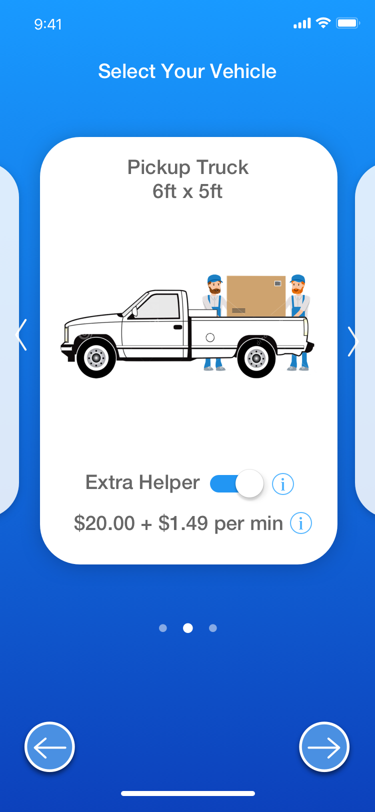
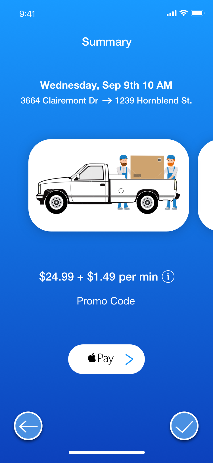
5. UI has been updated to a visually more appealing, cleaner and bolder look.